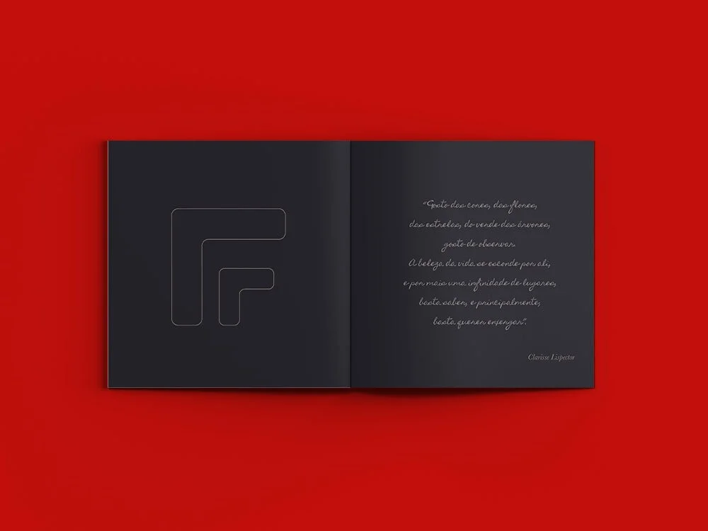
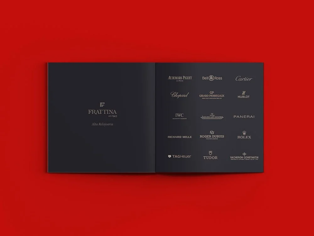
Logo Evolution & Catalogue Design
For Frattina, a renowned name in Brazilian fine jewelry, I was entrusted with refining the brand’s visual identity while preserving its heritage.
The logo evolution was intentionally subtle. Rather than redesigning, the focus was on precision — adjusting proportions, typography and balance to modernize the mark without disrupting recognition. The result is a cleaner, more contemporary expression that maintains the trust and tradition associated with the Frattina name.
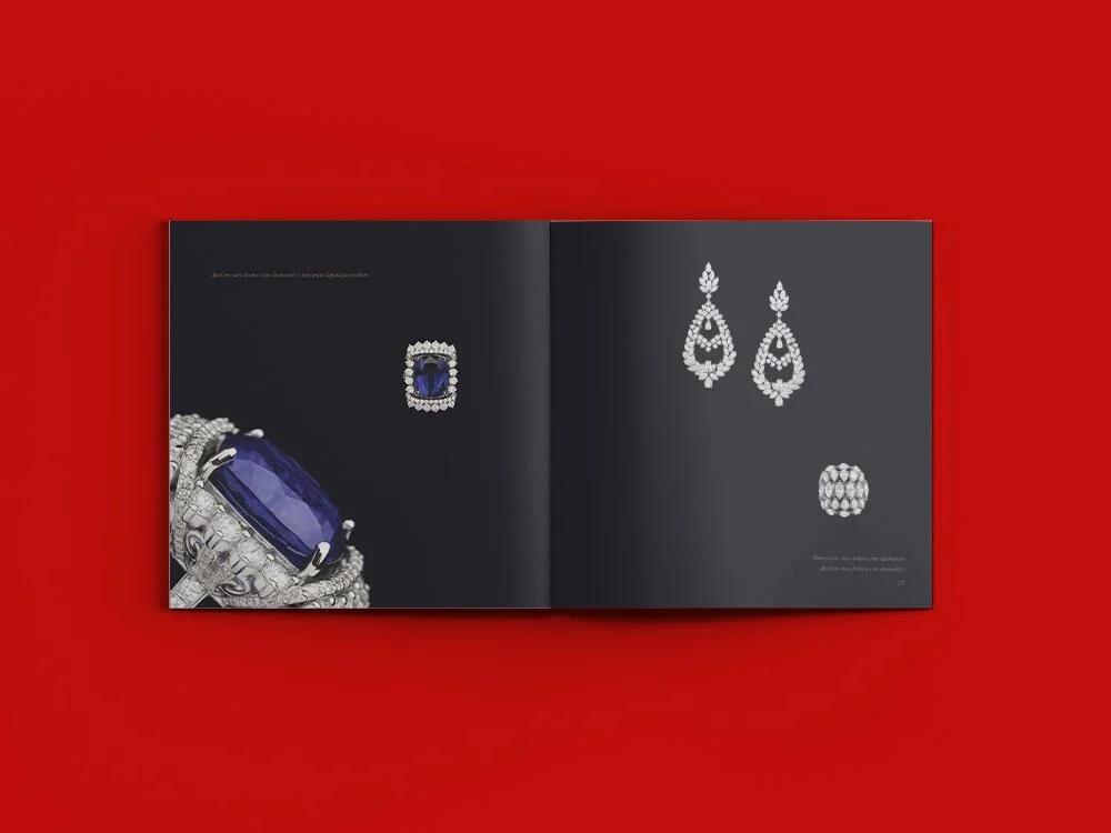
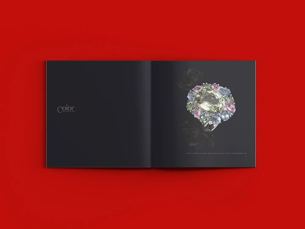
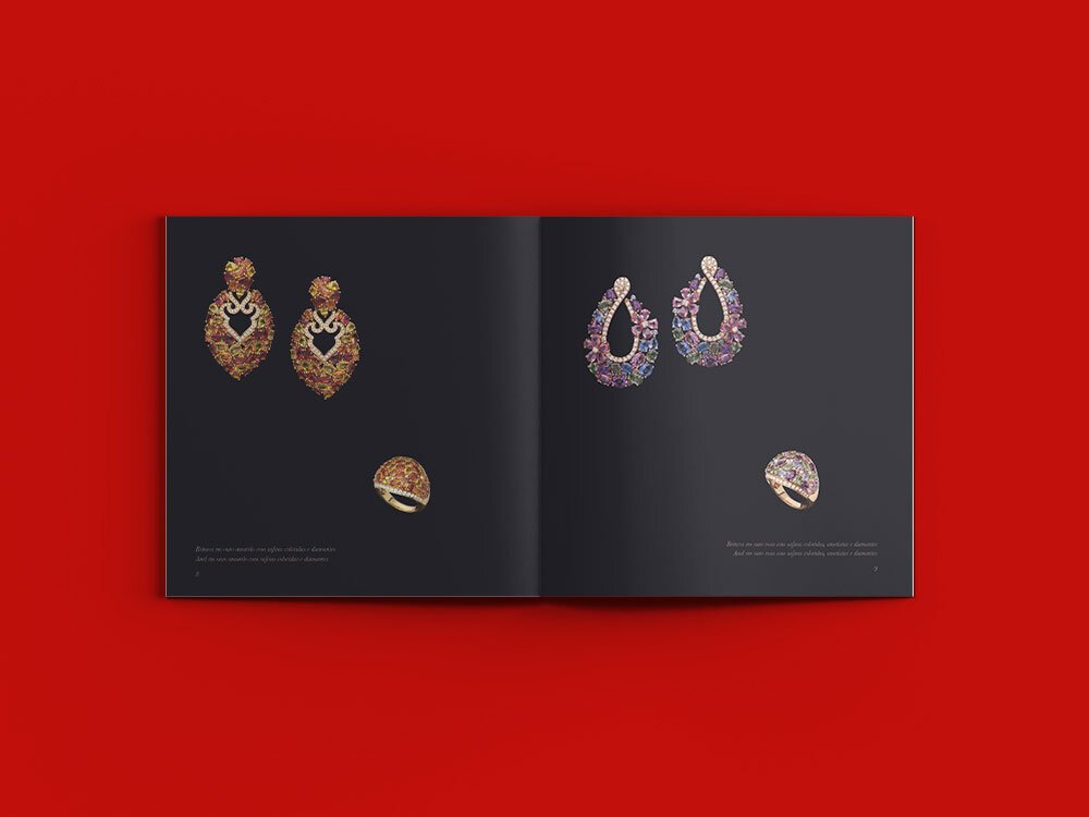
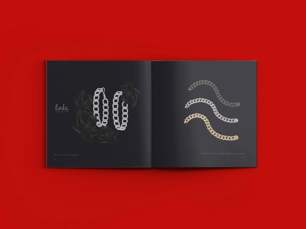
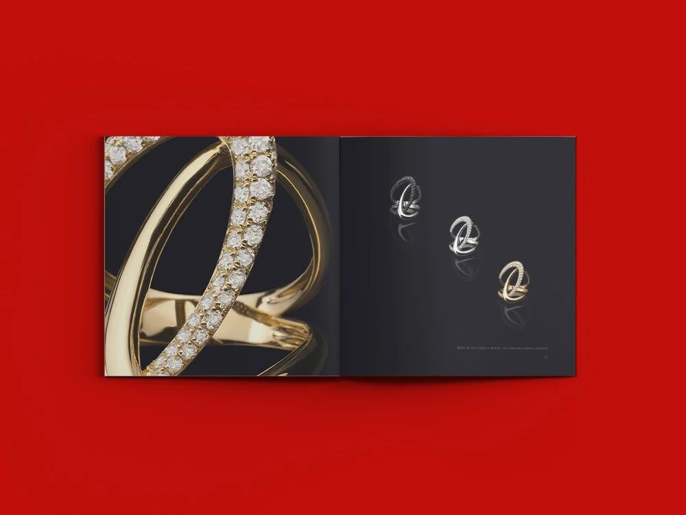
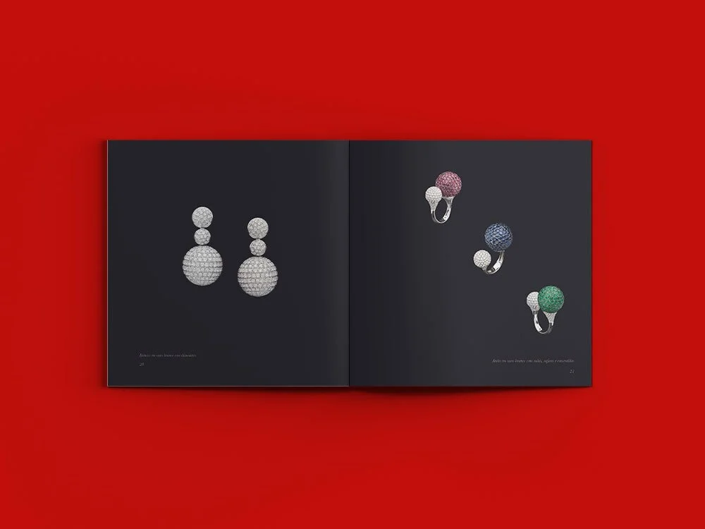
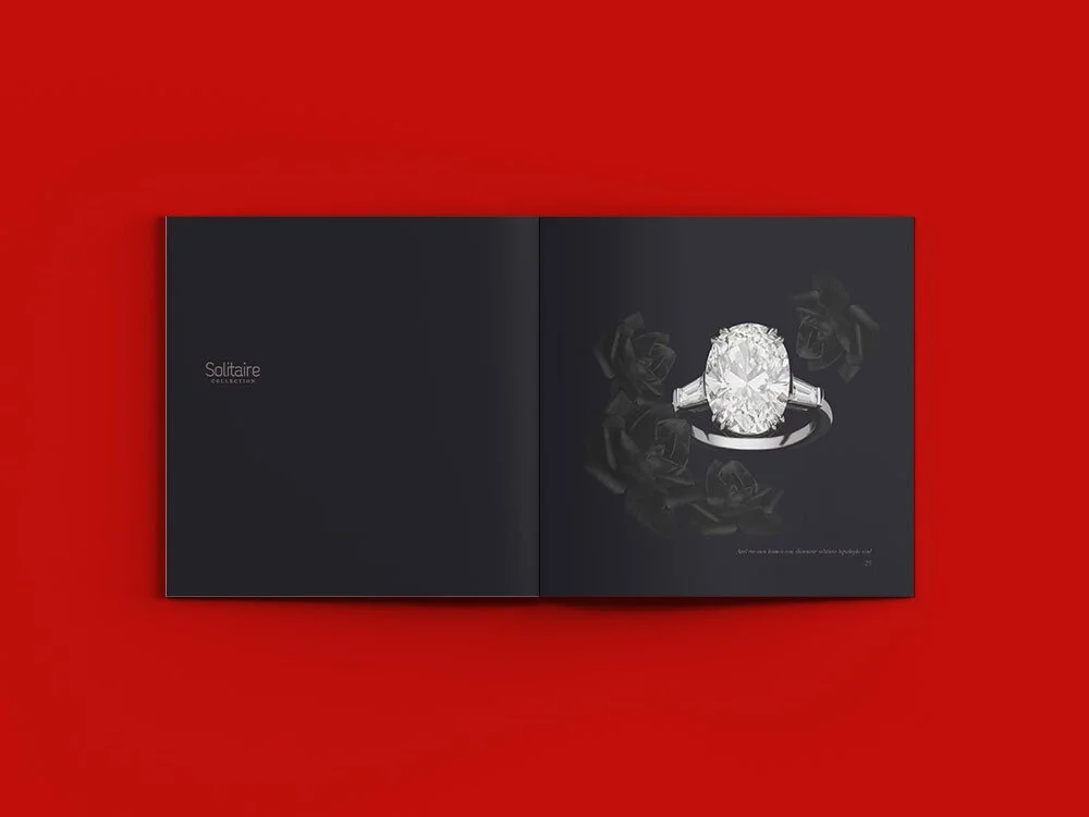
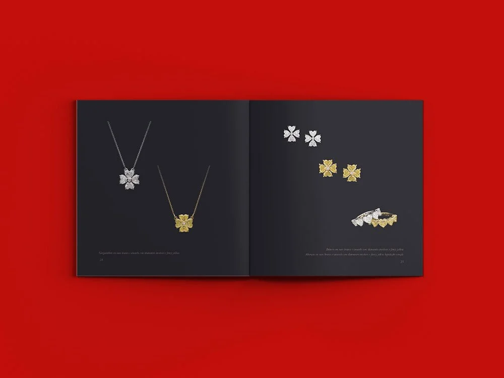
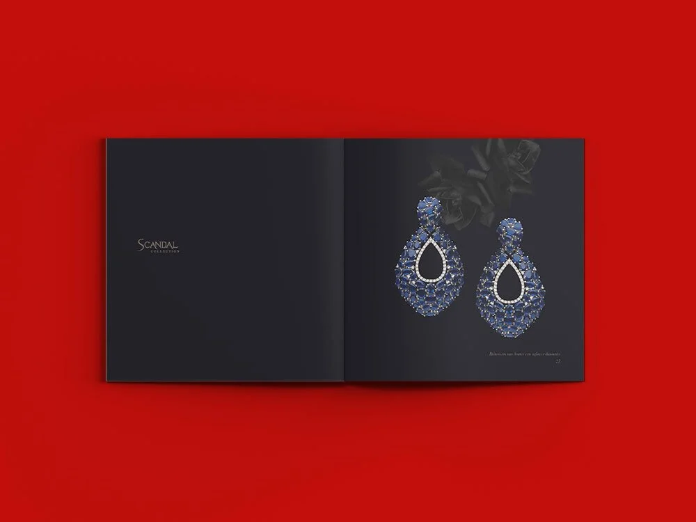
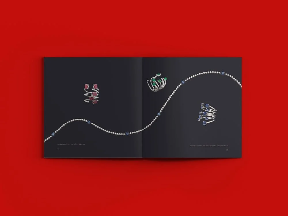
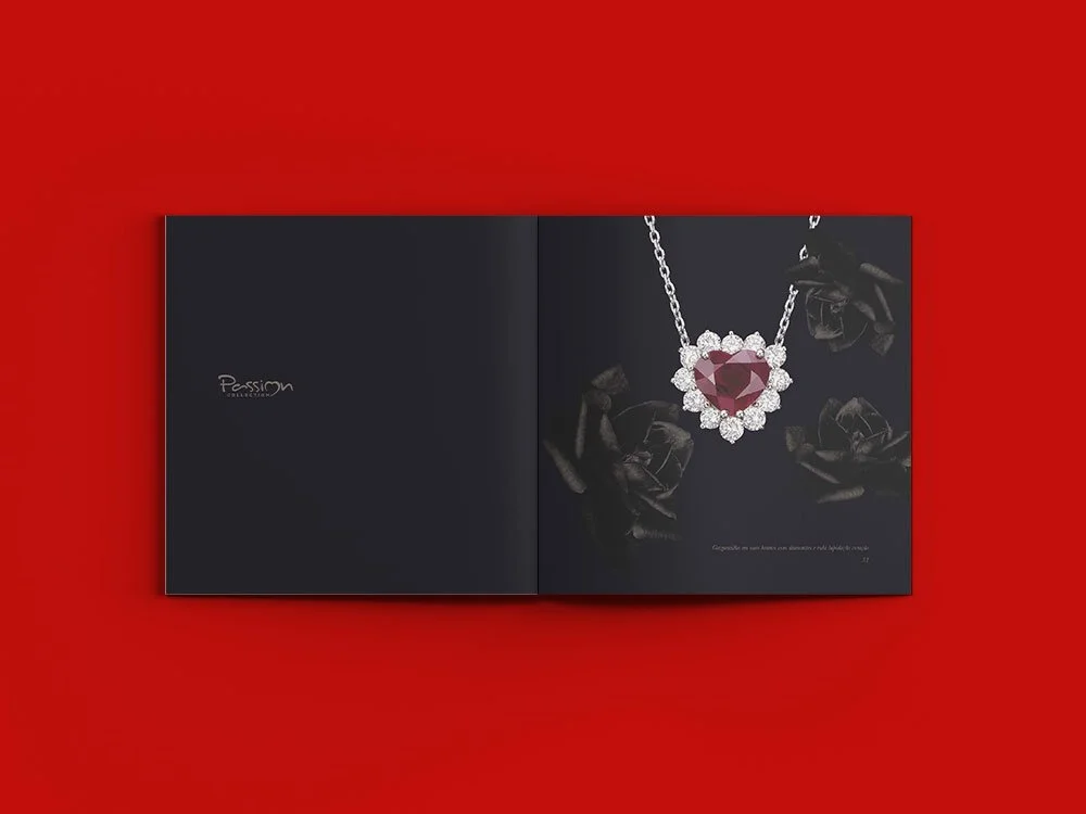
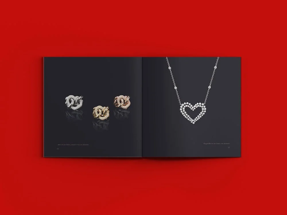
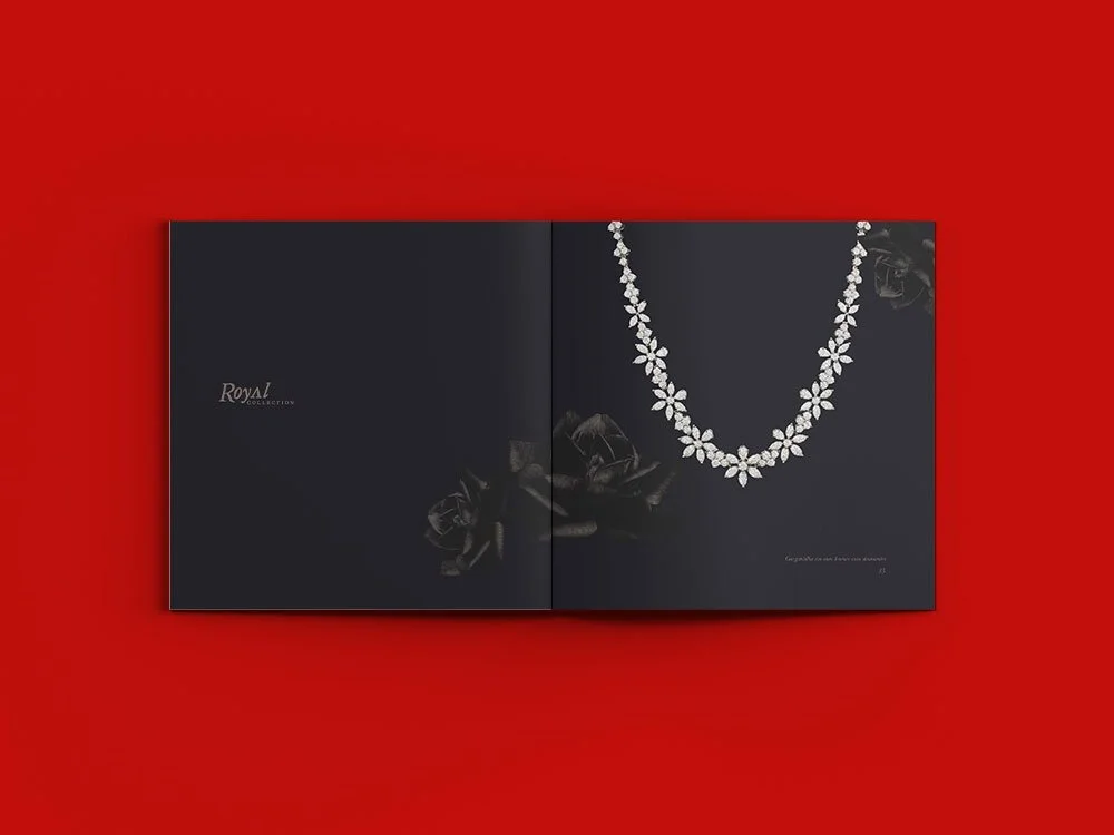
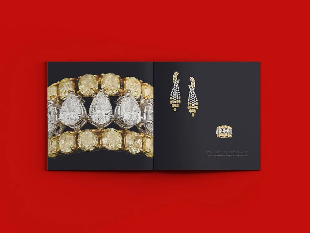
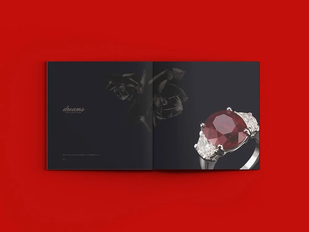
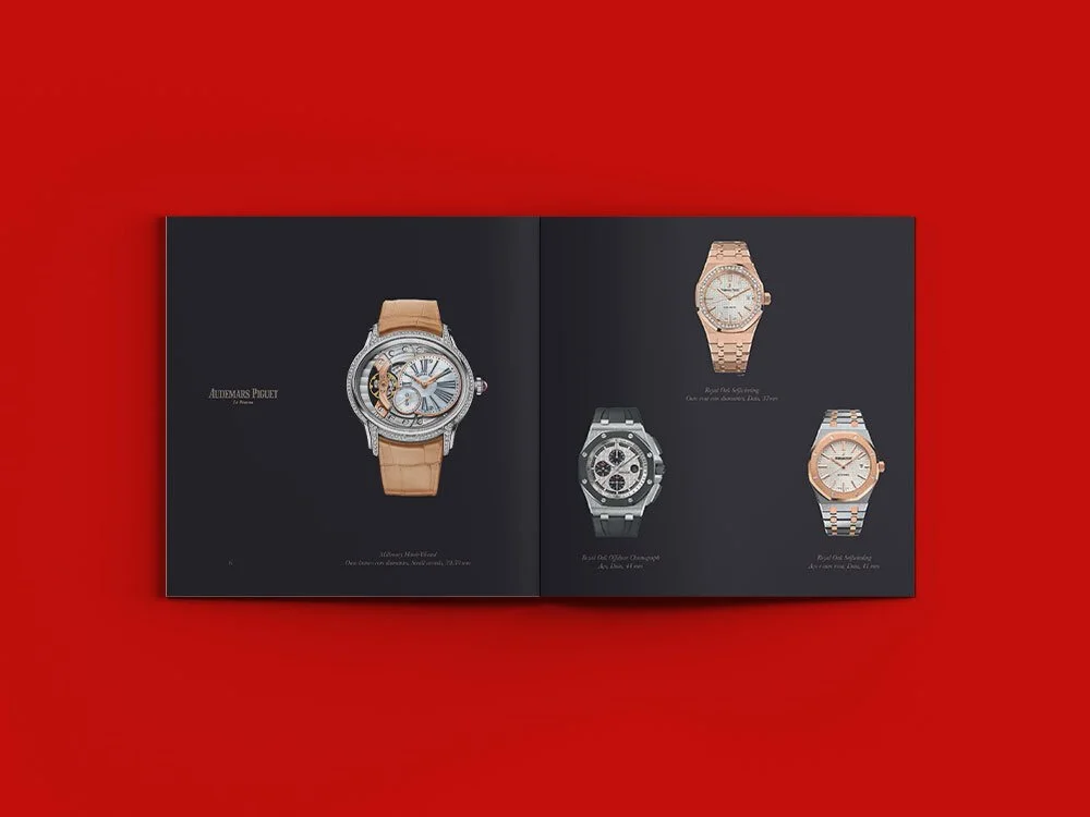
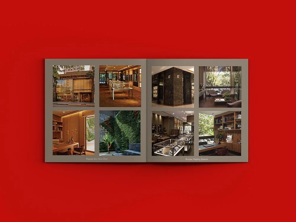
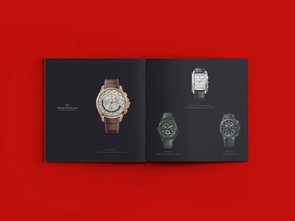
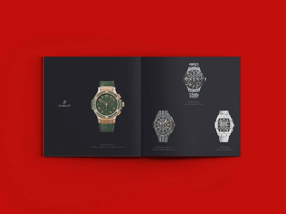
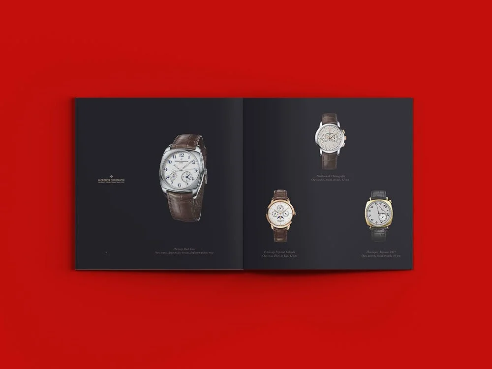
Alongside the identity update, I designed a sophisticated catalogue that translates craftsmanship into visual narrative. Through controlled layouts, refined typography and premium production standards, the jewellery was given space to speak. The visual language is restrained, elegant and timeless — aligned with the brand’s legacy.
The project balanced continuity and renewal: honoring decades of heritage while positioning Frattina confidently within a contemporary luxury context.