Financefair had grown into a confident funding partner for scaling businesses, but the brand no longer reflected its ambition or clarity. The rebrand aligned identity, positioning and visual expression with its core promise: fast, flexible, non-dilutive growth finance.
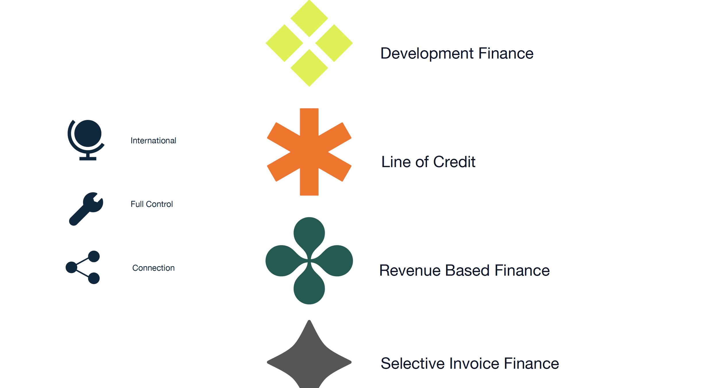
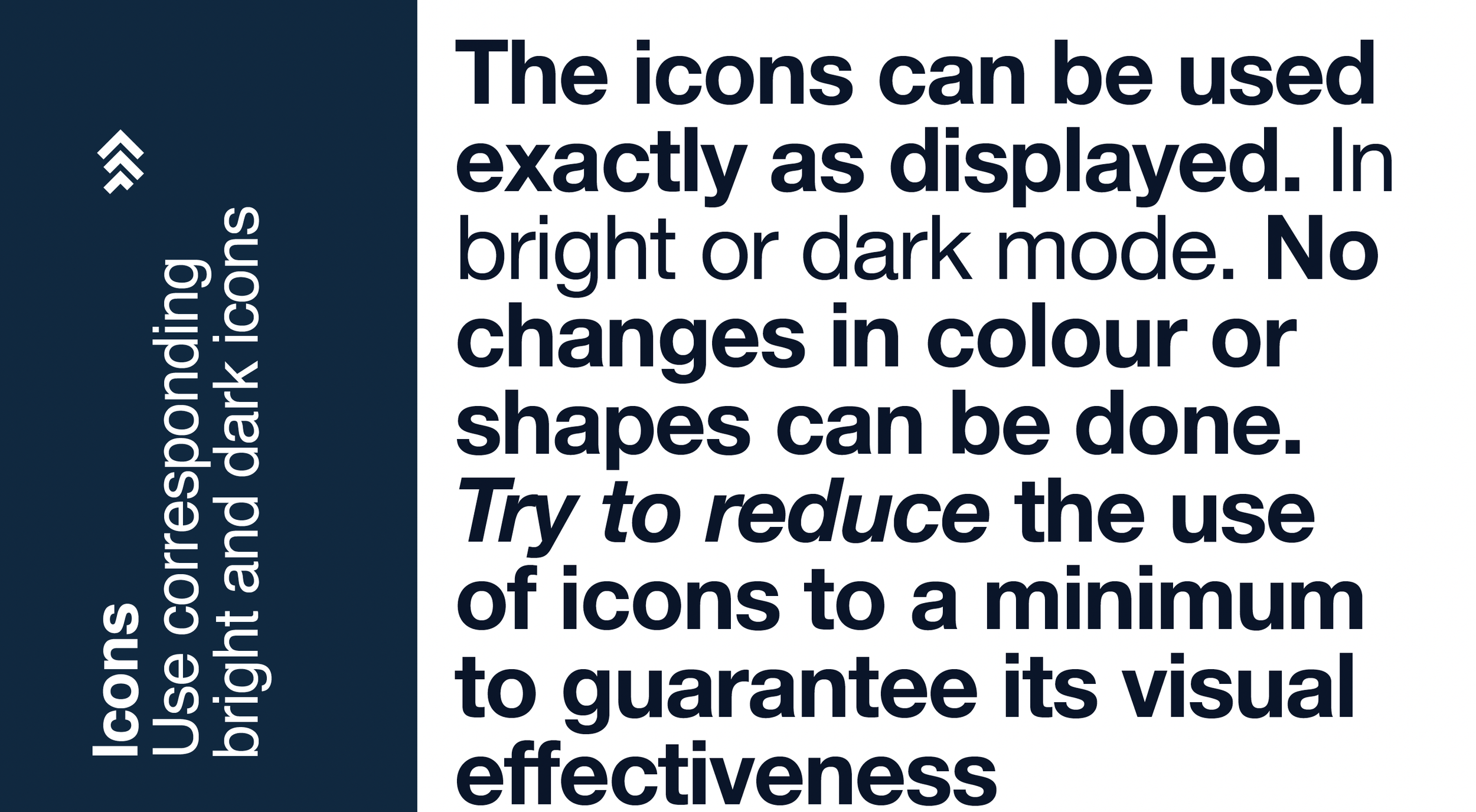
The work focused on building a disciplined, scalable system. A refined colour palette anchored in marine for trust, supported by sharp accent tones. Clear typographic hierarchy using Helvetica Neue and Avenir Next. A structured icon family for product communication. Strict logo and layout rules to ensure consistency across all touchpoints.
Imagery guidelines shifted the tone toward authenticity — real people, natural movement, professional but unforced environments.
The result is a modern, coherent brand presence that communicates credibility, pace and simplicity — without overstatement.